How Do Images, Shapes, and Ideas Back and Forth Bring Life and Color to NextGenC?


NextGenC is a project that seeks to conceptualize, measure, and critically analyze youth participation and the mediating role of digital technology and informatization in the governance of intermediate cities in Colombia. Formally, this has been the direction of our work as we investigate, advance, and transform youth participation and urban governance in Colombia. But how can we create a tangible and memorable visual identity with the necessary elements to transcend a screen, a set of words, or academic results?
Take a few seconds to imagine this situation: you want to start an initiative or, why not, create your own personal brand to project to others. You want your name, logo, or “bat-signal” to immediately remind anyone who sees it of what you’re launching, proposing, or communicating. What would you do first? Take a moment to picture it. What colors would you use? Would your logo have bat wings? Times New Roman, Arial 12, Verdana?

Now imagine that this decision isn’t made by you alone, much like the process that determined the coat of arms and colors of the flag of the city or country from which you are following and reading this. In the case of NextGenC, there are seven organizations, some based outside Colombia, each with its own graphic identity, members with diverse ideas, tastes, colors, images, and life paths, all of whom continue to contribute their grain of sand to ensure this project reaches and impacts more people.
It’s a journey filled with questions, sometimes contradictory ideas, and feedback—a lot of feedback—but, like Rome, it wasn’t built in a day. In processes like this, the first step is always to consider who the project is aimed at—the target audience, in advertising-marketing terms. This is a major challenge: how to channel a familiar, professional, appealing, visually pleasant, and harmonious image that resonates with people and makes them feel represented. In our case, while we mainly work with young people from intermediary cities, we wanted to go further, reaching people from various regions, age groups, and even preferences.
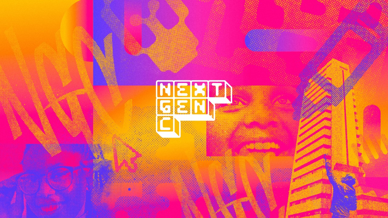
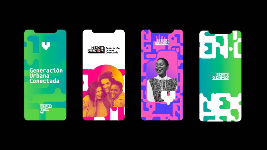
Thanks to Hay Día, the agency that has supported the entire process of web design and graphic identity, you are able to enjoy everything this page and project have to offer. With the audience defined and the name settled—a process we shared in our previous article—each element on the website, from colors and typography to each component, is the outcome of co-creation sessions with various project team members. These sessions included brainstorming, image and keyword association exercises—like a collage—focused on concepts such as governance, youth, urbanism, digital technology, and participation. These exercises gradually shaped what is now the graphic identity of NextGenC, encompassing the logo, color palette, typography, iconography, and brand applications.
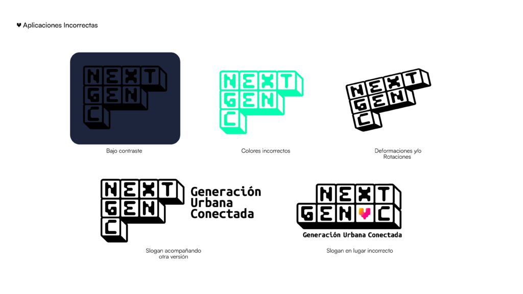
For the logo, our "bat-signal" in a hypothetical Gotham City, we sought an image that conveyed knowledge, familiarity, originality—something easy to look at and recognize. In this case, a puzzle with the project’s name coming together symbolizes openness to participation from people across different regions of the country and, at the same time, the ability to reach a common ground. Numerous meetings with various sketches, colors, and backgrounds arranged in grids were shared and voted on with project partners until we reached the design you can now see in the top left corner of your screens.

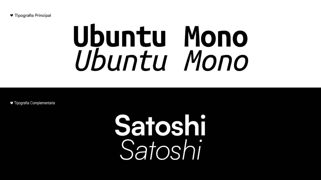
The color palette you see was also decided through a series of votes by project members. Of course, there are thousands of possible combinations, but we wanted to start with vibrant tones and gradients that reflect modernity, empathy, participation, and independence. As for the typography—a challenging decision given the variety of font styles—we adjusted based on criteria that ensured the font would not detract from but rather highlight and capture attention toward the project’s message. White is always a good option, but not the only one. Colors and fonts need to be as complementary as Batman and Robin, but achieving that takes time.
Finally, the iconography is a collection of elements designed to convey meaning and signals based on keywords central to the project, developed through our working sessions. Remember that exercise of associating images with keywords? This is precisely one of the outcomes of that process.
We summarize how we’ve created images, colors, and associations that represent what NextGenC means to us. This space is open for you to follow the project and reach out to us, with the hope that this process inspires you to create your own personal brand or graphic identity—one that distinguishes you from others while also reflecting what you want to showcase and express.
